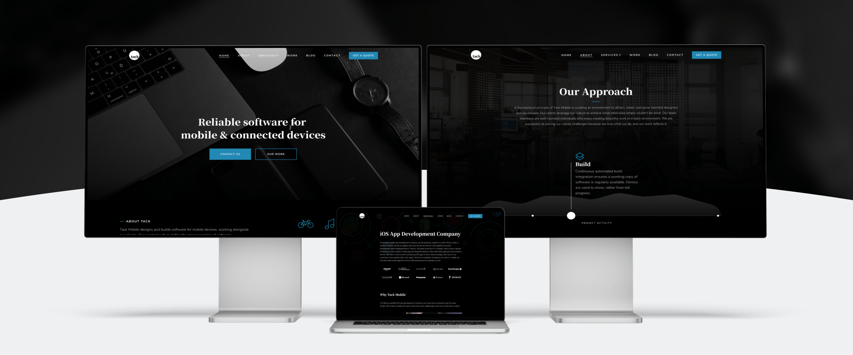
Tack Mobile builds high quality mobile applications and websites for companies across the world. The website is their primary tool for attracting new clients and hosting their portfolio. With growing business and outdated content, the Tack site was due for a refresh.


The previous Tack Website utilized a light color palette and relied on text to highlight key pieces of information. The new style uses a high-contrast, dark theme and extensive iconography, allowing potential clients to understand the company more quickly. Microinteractions were also prototyped and developed to give the website a slick, seamless experience that translates to Tack's work in the mobile app space.
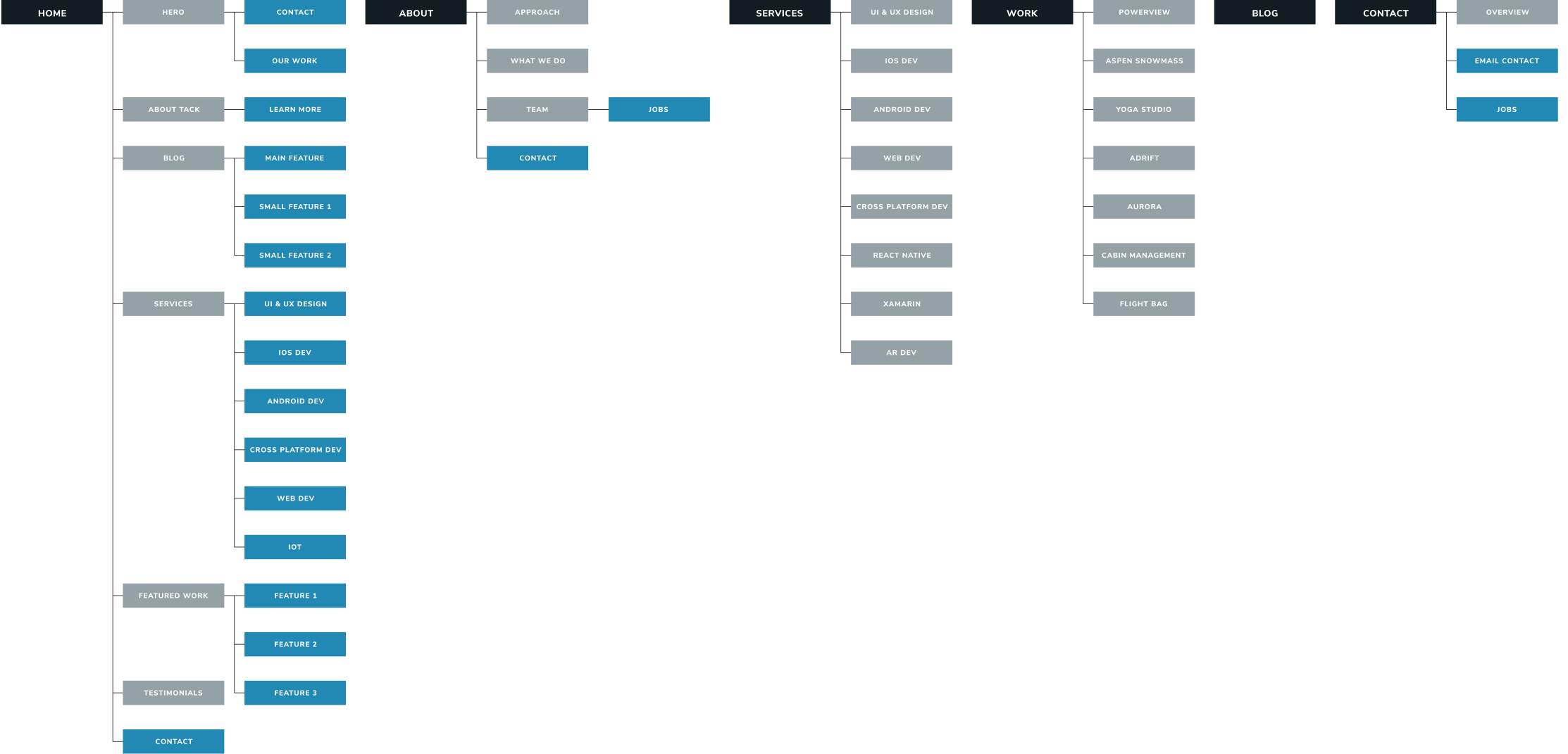
The website was redesigned from the ground up, meaning a high level sitemap was needed to understand the scope of the work. The sitemap also helped our marketing team track links in Google Analytics to better inform future design decisions.
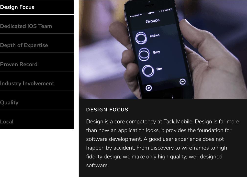
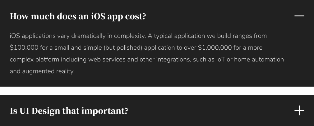



With the addition of so many new sections, copywriters wanted the ability to drop in interactive components to break up large blocks of copy. To achieve this, our design team created a library of UI components that allowed for more interesting engagement with the content. With numerous similarly-structured pages, these components sped up development and will be easier to maintain in the future.
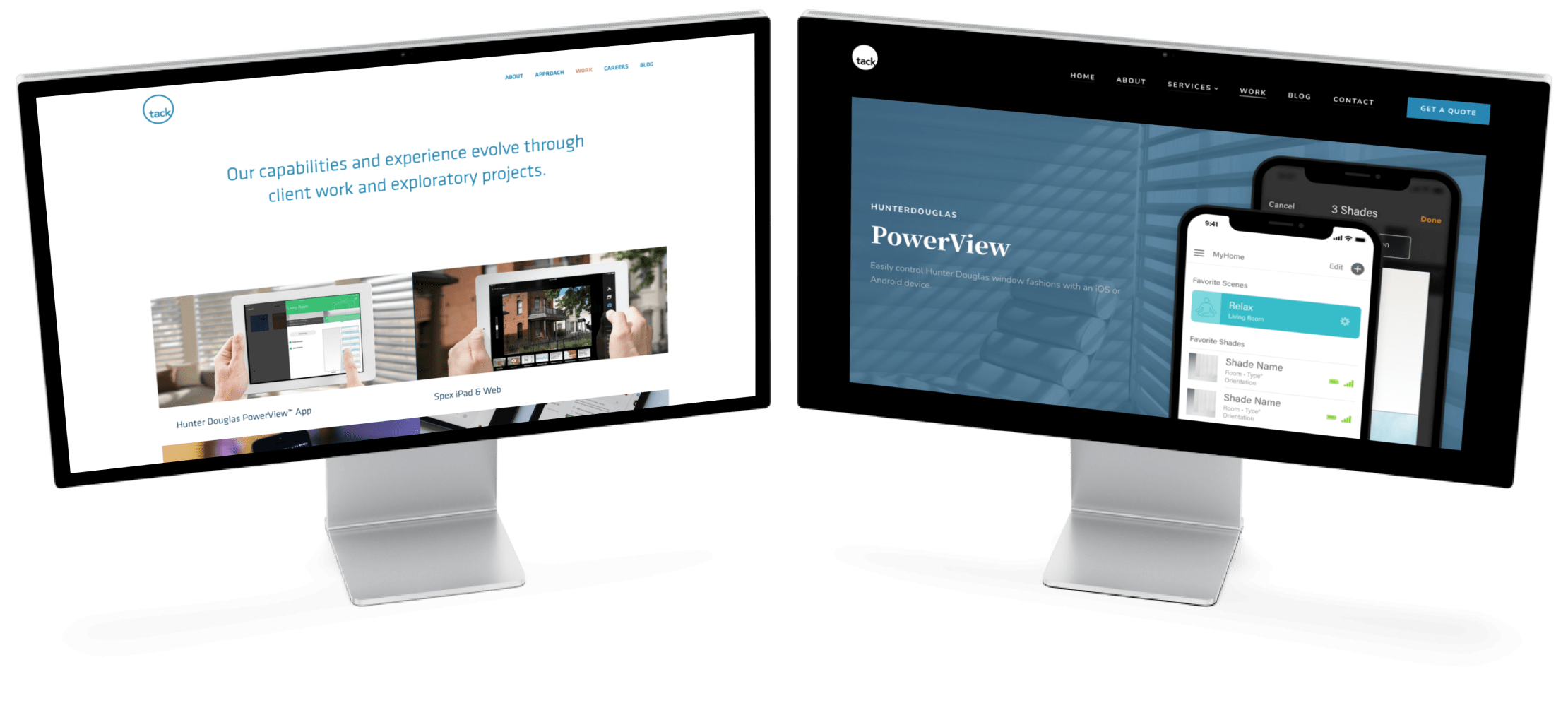
The old work section (left) and updated version (right)
The old work section of the Tack website wasted space at the top of the page with text and did not provide efficient space for the actual work. The updated section dedicates full screen real estate for each project while allowing for room for a brief explanation.

Individual work pages
A redesign is always an exciting opportunity as it offers the ability to compare the two sites objectively and subjectively. From an analytics standpoint, the website was successful in increasing SEO rankings and clickthrough rates. The Tack team credits this success to our focus on appropriate structure and engaging, interactive content. From a visual standpoint, our team feels our dark UI is more visually striking and helps to put the focus on the work itself. Overall, the site redesign was a success and the Tack team is eager to see what exciting work it leads to.