Garmin Pilot is an interactive flight app packed with features that can be used before and during flights. A key feature of the app is flight planning, which allows pilots to use a map to find the safest and most efficient route to their destination. As a designer at Tack Mobile, I was tasked to review the app and come up with some ways to improve the user experience and interface to help pilots plan their flights more efficiently.
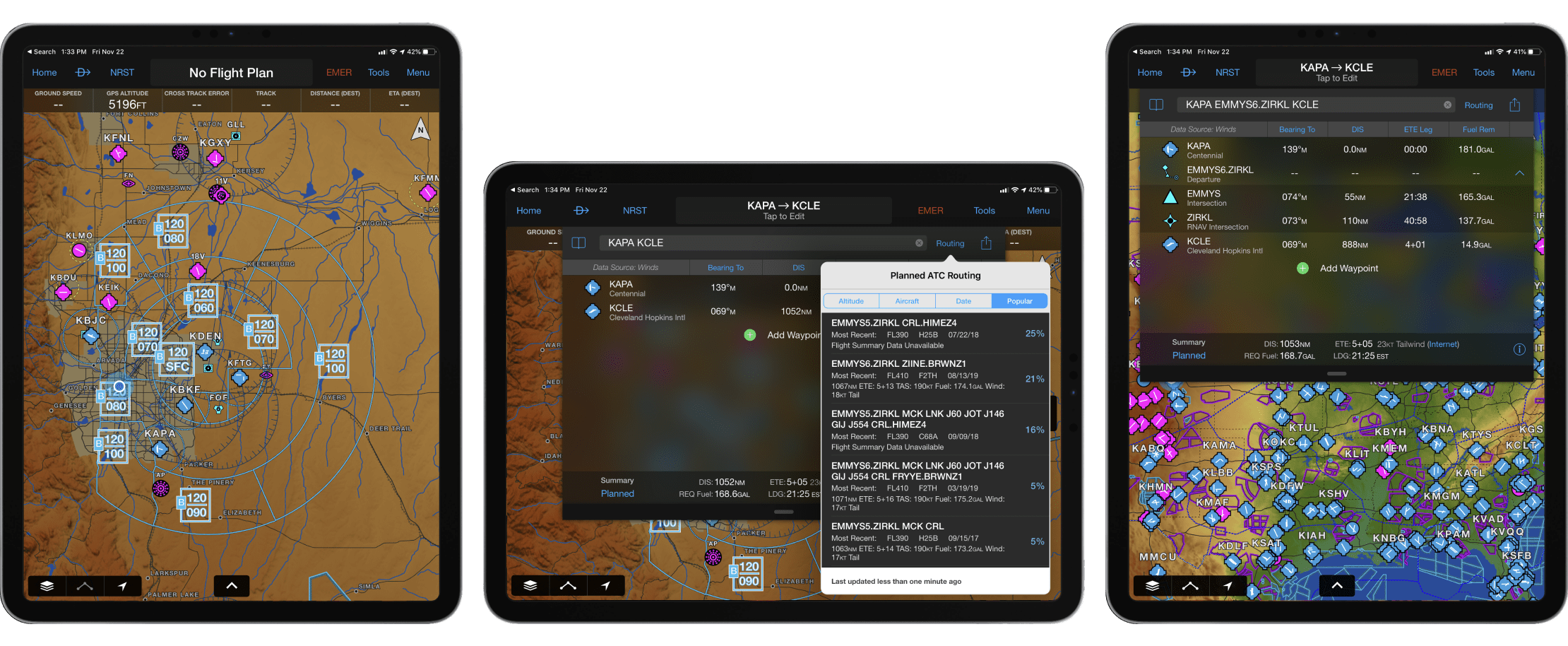
Existing Garmin Pilot screens (2021)


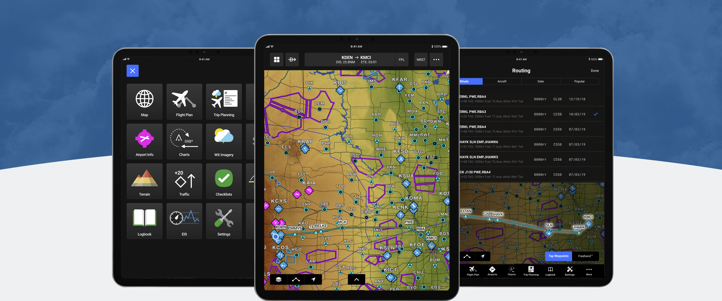
The user interface for Garmin Pilot focuses heavily on text buttons and felt slightly dated. To bring it to more modern iPad standards, I ensured that all text buttons had a tap area of at least 44 pixels and utilized icons where appropriate to create more spacing within the design. A darker interface was used to put more emphasis on the map and create higher contrast for icons and buttons. I used this library to design the following prototypes with a consistent look and feel.
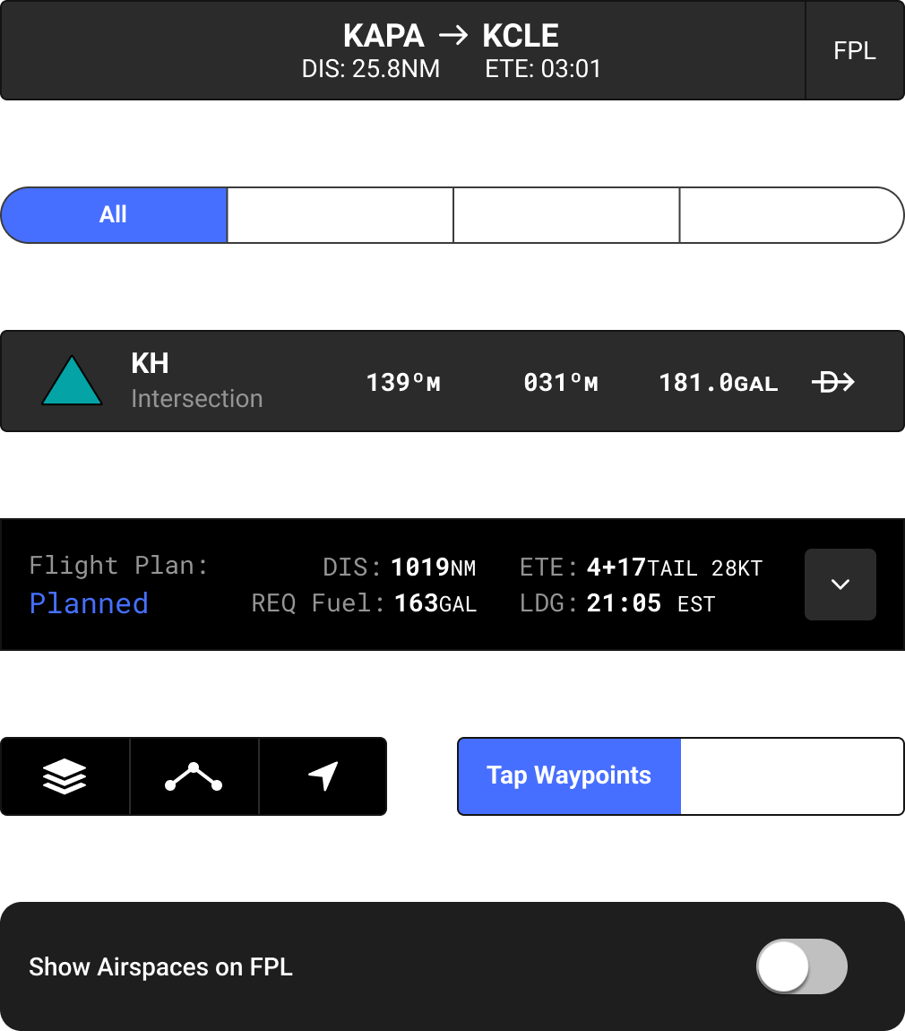
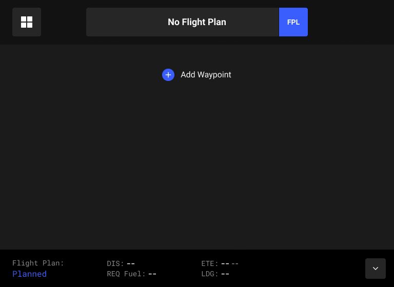
Quick access to the flight plan is an essential feature of the app. We maintained two ways to access the flight plan, with one being a more detailed view that allows for editing waypoints and another that is less obstructive and intended for in-flight use.
I evaluated how Flight Plan creation and editing could be made as fast and intuitive as possible while leveraging the available screen space. After investigating and experimenting with several different methods to edit flight plans, this solution represents the best blend of differing UI strategies.
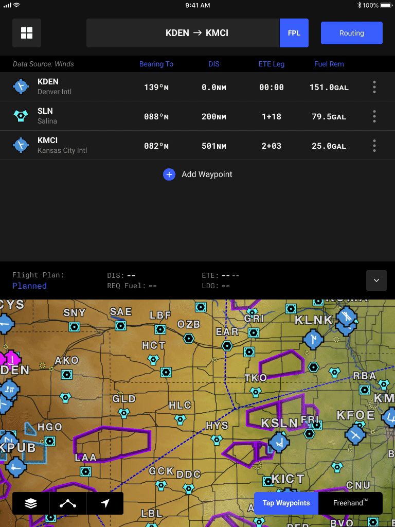
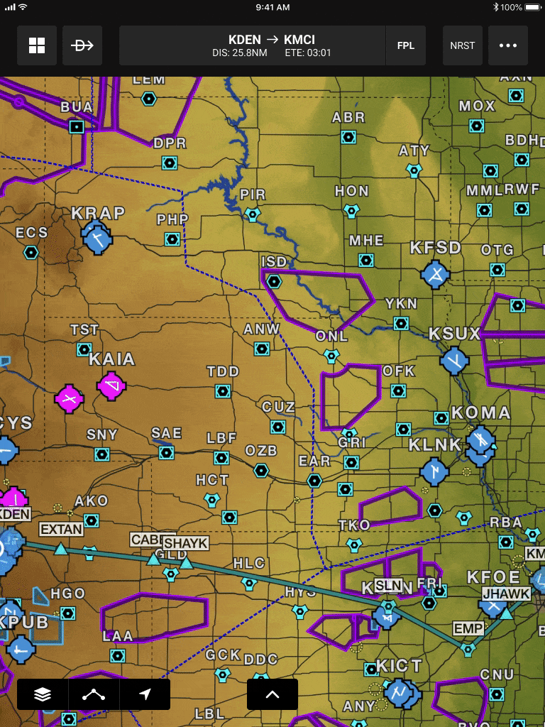
Viewing default routes in context, with weather and other overlays, eases the decision making process for pilots selecting their own routes. The design solution improves on the original by displaying routes on the map in real time and providing better organization of data.
This brief exploration shows that it is possible to completely transform an app with just a few tweaks to the interface. Without changing major functionality, the UI adjustments allow for a snappier feel and a more modern look. These improvements all lead to an improved user experience for pilots, making for a safer flight for all passengers.