Altra produces innovative running shoes that encourage natural foot movement and body positioning. Altra's product description page (PDP) did little to explain the unique advantage of their shoes and users were left wondering why they would choose Altra over another brand. As the lead UX designer, I redesigned the PDP to highlight Altra's benefits and incorporate their brand voice more effectively.
User testing allowed me to hear directly from runners and understand what was and wasn't working with the original PDP. I identified the following key issues:
Users were unlikely to read the lengthy description and long list of details. Scanning for key words and glancing at small sections was preferred.
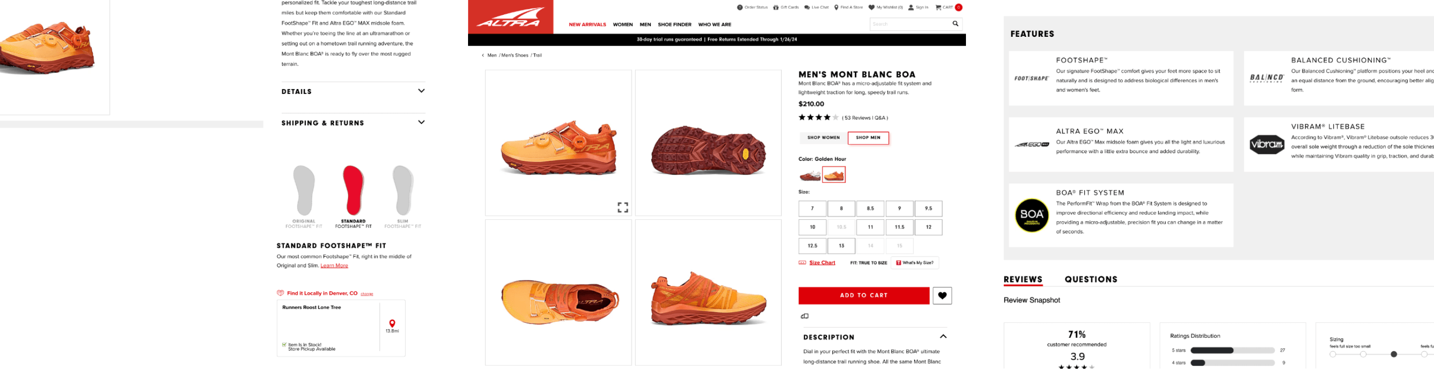
Users were unable to quickly find the shoe's intended use. Some users didn't feel confident in their purchase unless they did more research on their own.
Users appreciated Altra's detailed, closeup imagery but wanted to see images of the shoes in the wild on runners' feet. This helps understand the look of the shoe more naturally.
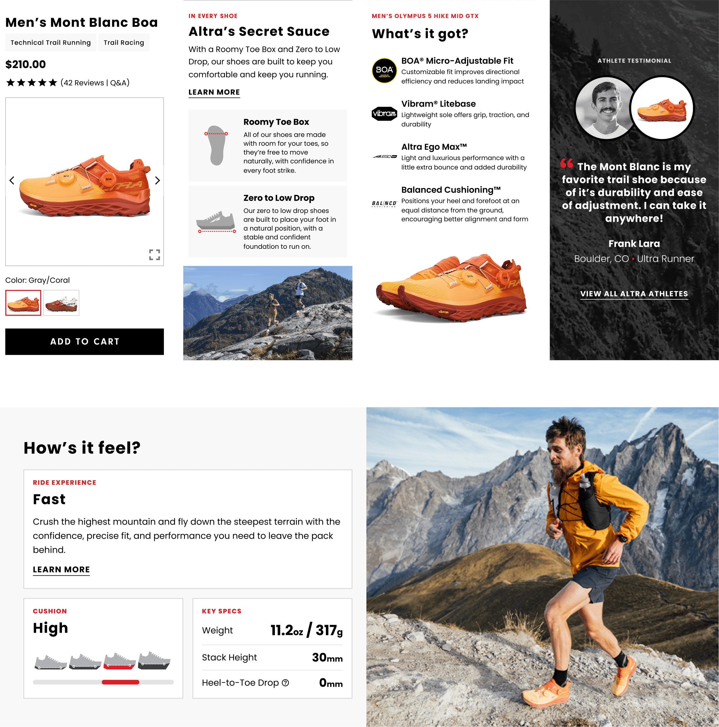
Altra was missing an opportunity to highlight what made their shoes different: a wide toe box and zero or low drop. Users struggled to identify this and weren't convinced that Altra would be superior to other brands.
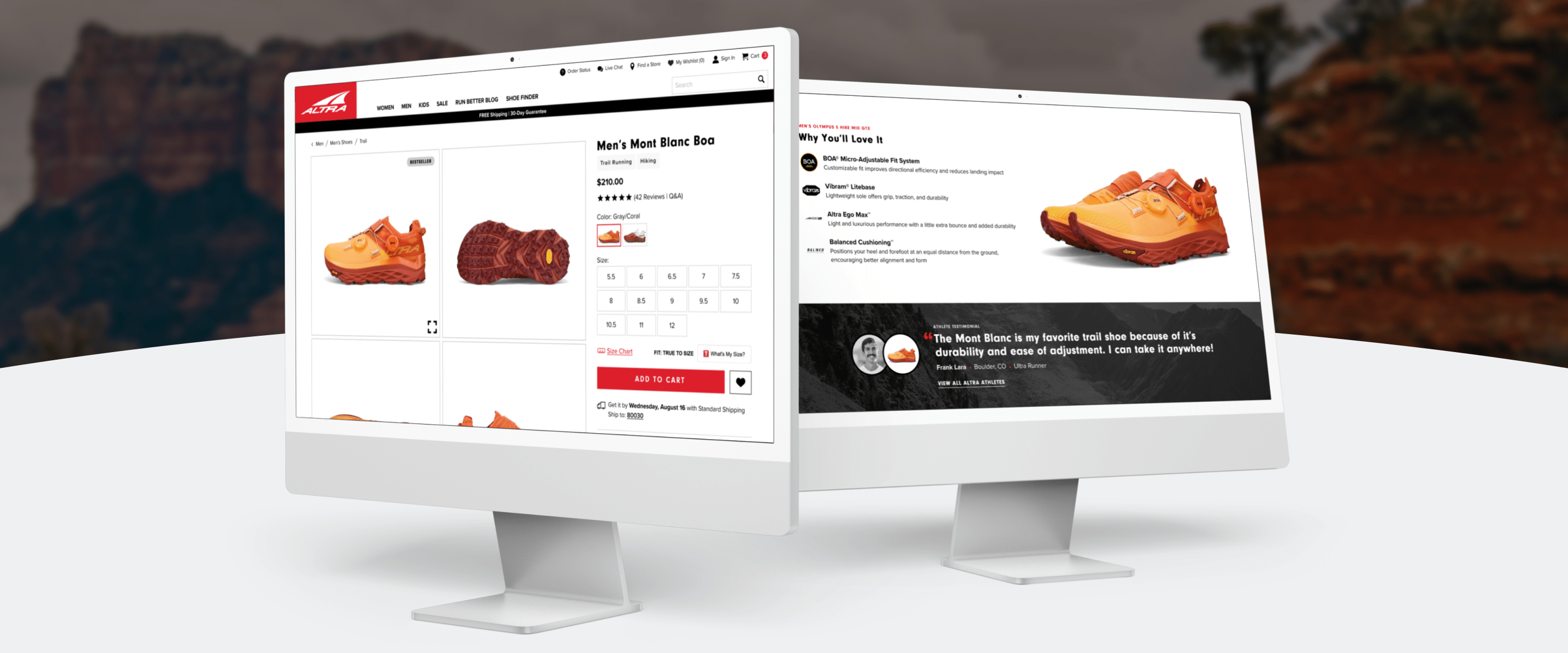
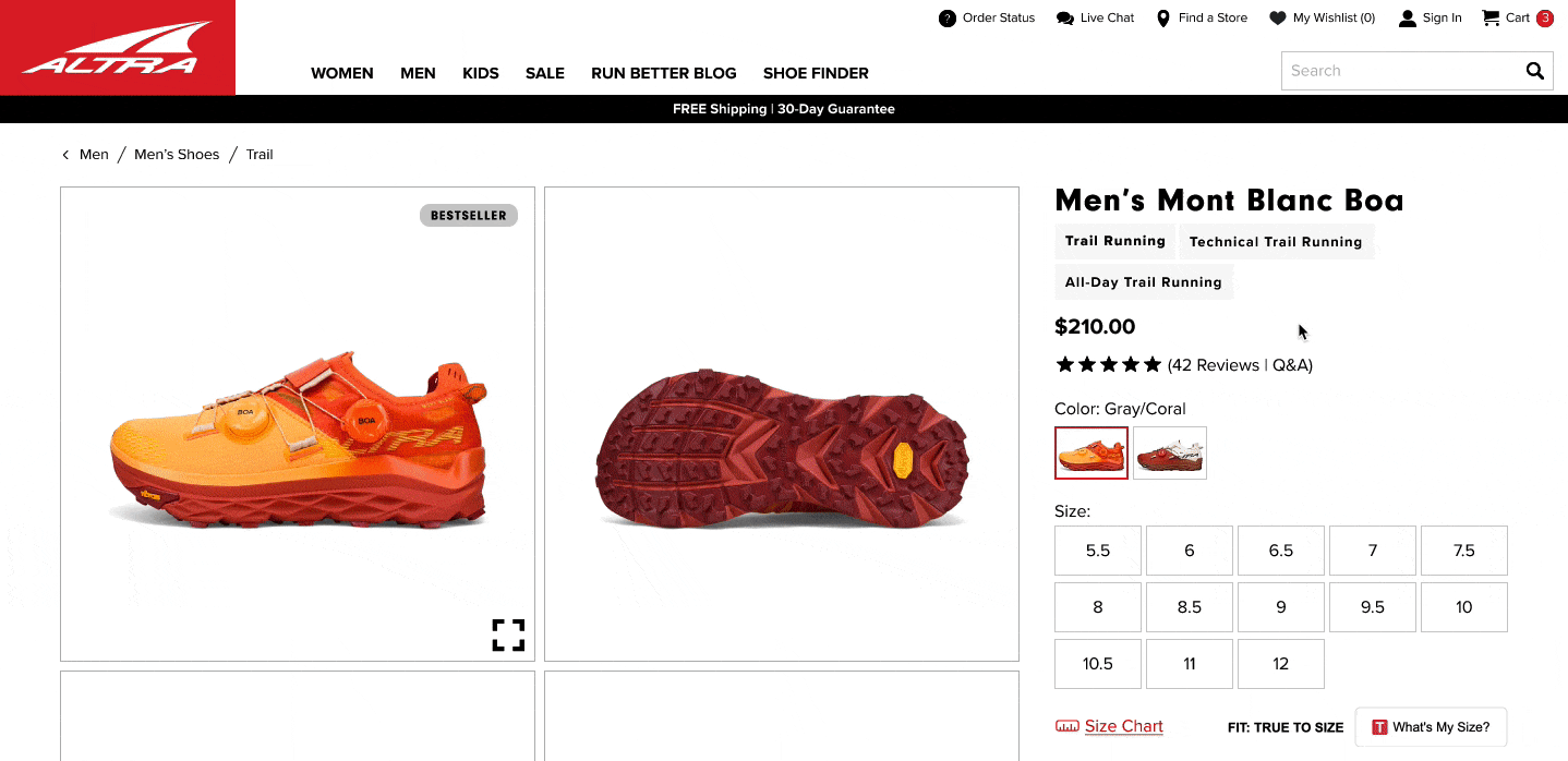
Old Altra PDP (June 2023)
I also gathered PDPs from other running shoe companies to identify potential user expectations, innovative layouts, and industry best practices. In addition to the insights from user testing, I used the following key findings from the competitive analysis to guide my designs:
Icons are used extensively to enhance blocks of copy. Some are helpful and descriptive, while others are slightly arbitrary and are simply used for visual interest.
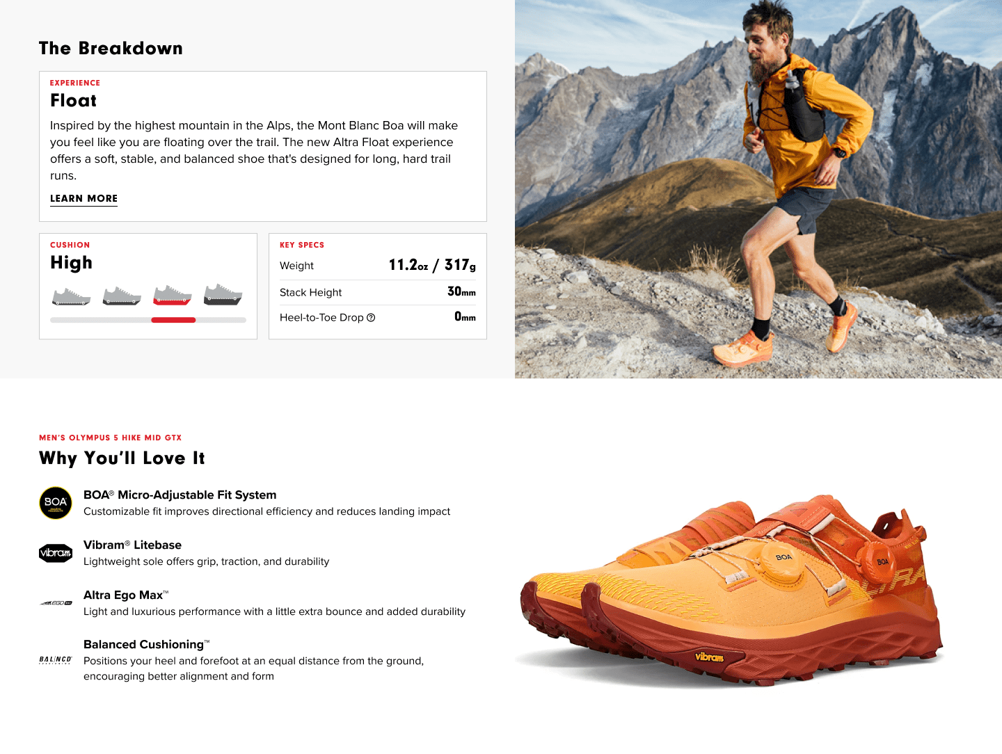
Many of Altra's competitors do a great job of showing the features of the shoe, rather than just talking about them.
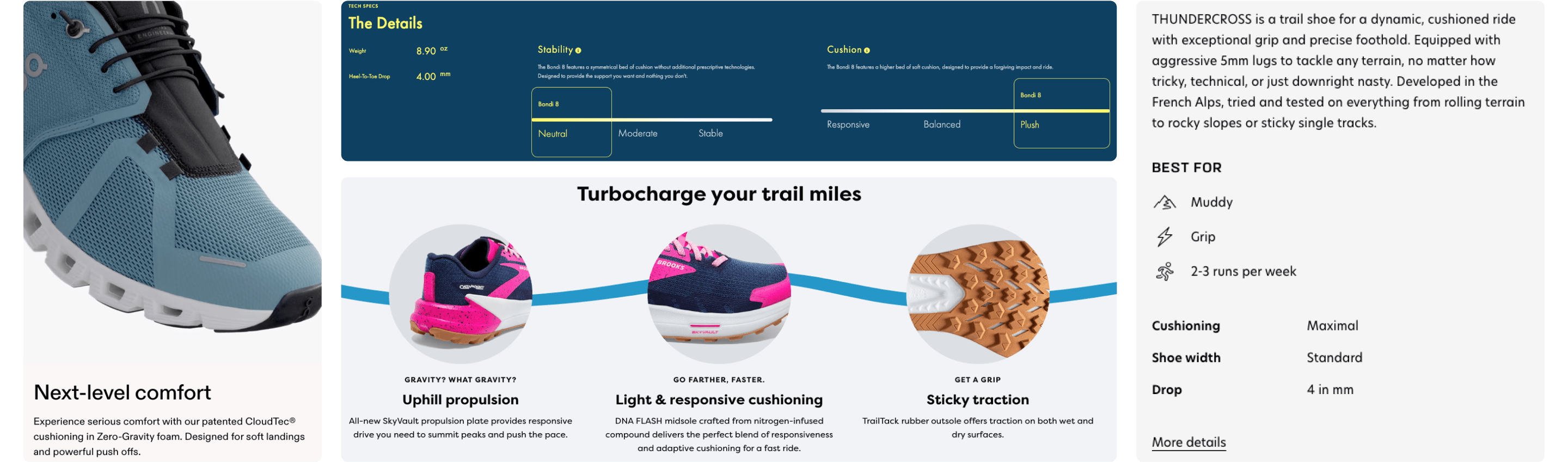
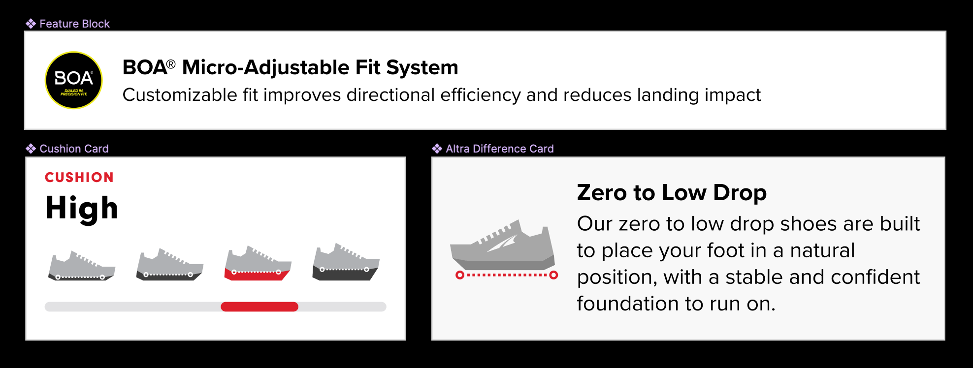
Charts, meters, and infographics are used to help users understand a shoe's characteristics. Cushion was identified as a key spec that users seek out.
Standout competitors used far fewer words in their main sections than Altra. Expand/collapse elements and anchor tags were used to tuck away larger blocks of text.
A few content blocks from competitors (On, Hoka, Salomon, Brooks)
Additional rounds of user testing during the design phase allowed for rapid iteration and detailed feedback. Close collaboration with the brand also allowed for a smooth workflow across teams and resulted in the following key features.
Expandable previews and panels encourage deeper engagement without cluttering main sections.
People like pictures! And with the addition of lifestyle imagery and infographic sections Altra is able to tell a more effective story.
Short sentences and straight-forward language prevail over long, jargon-filled paragraphs.
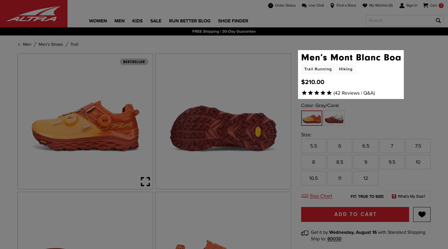
A simple addition with a big impact. Small labels are placed as high as possible on the page to summarize what the shoe is used for.
All major metrics improved after the launch of the PDP redesign. Conversion rate and views per session increased by 6% and 9% respectively, while bounce rate and exit rate decreased by 16% and 13% respectively. Altra continues to utilize the updated PDP template as it has proven to be beneficial for users and flexible for any new products that are launched by the brand.